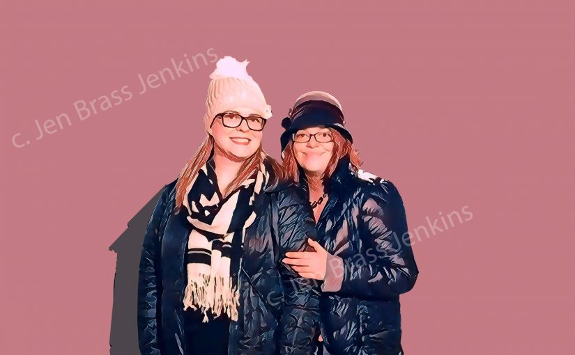
Holiday Story: Classic Sis Holiday Pic Overlays Pantone Meme
Category Is: Pantone
Thanksgiving of 2018 found us sisters in London. This particular photo Julie took of us at the restaurant Sketch, which is AH-MA-ZING. It’s an art installation and a restaurant in one.
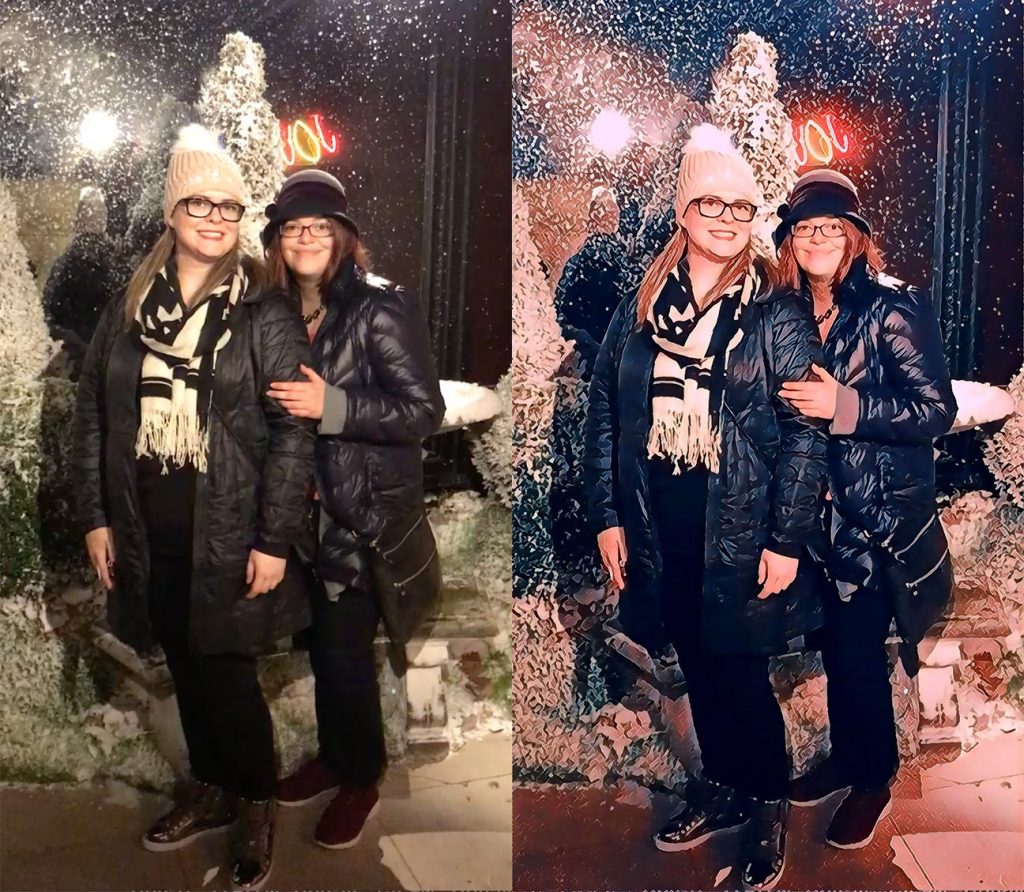
With all the travel, I wasn’t feeling a big photo shoot, so I chose a photo of us that felt pretty fresh and did some juxtaposition. How did I get the color variations you ask? Sorry all—a girl’s got to retain a little mystery.
Inspiration
Pantone is a company that “define[s], communicate[s] and control[s] color.” Established in 1963, Pantone sets the graphic arts industry standards for color hues. Pantone predicts a color of the year, consults with fashion companies, architecture, industrial design (think the color your car is painted), and more with tools that make for consistency in color across products.
Have you ever seen a Pantone color card? They look like this:
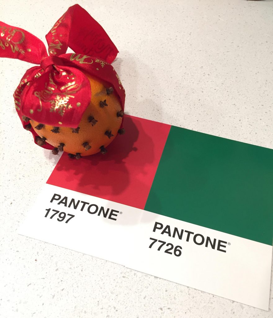
I kept seeing things inspired by the Pantone cards online like this that made me salivate:
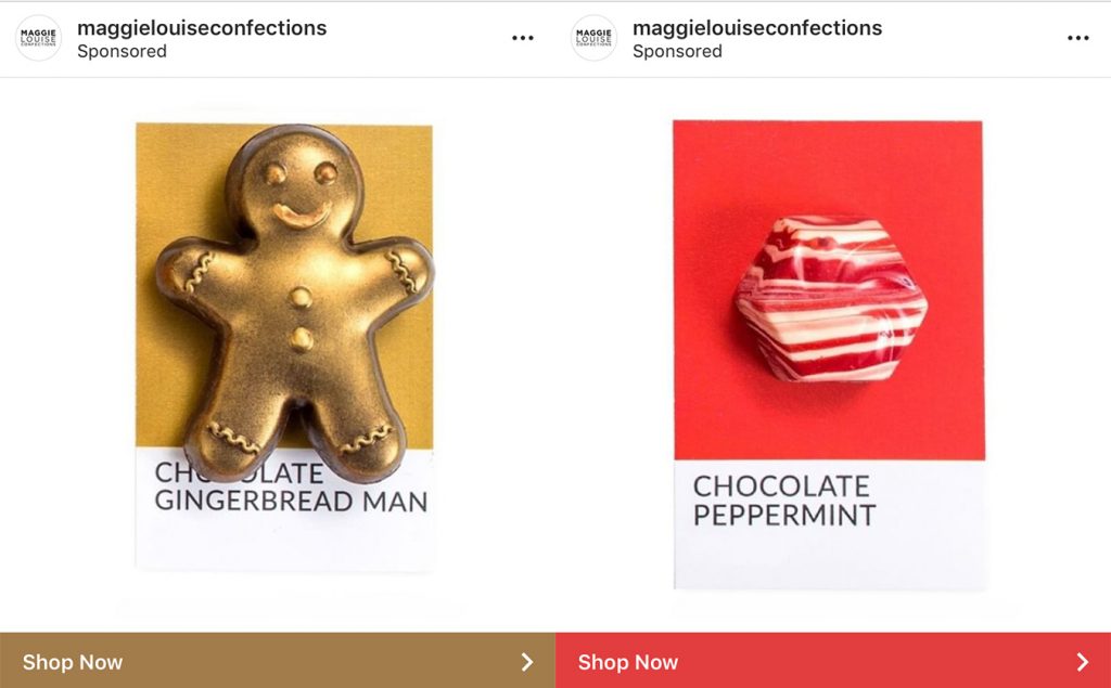
The clever riffs on Pantone color match-ups with found items made me wicked intrigued. So, when it came down to the line, I picked a photo and created a Pantone background:
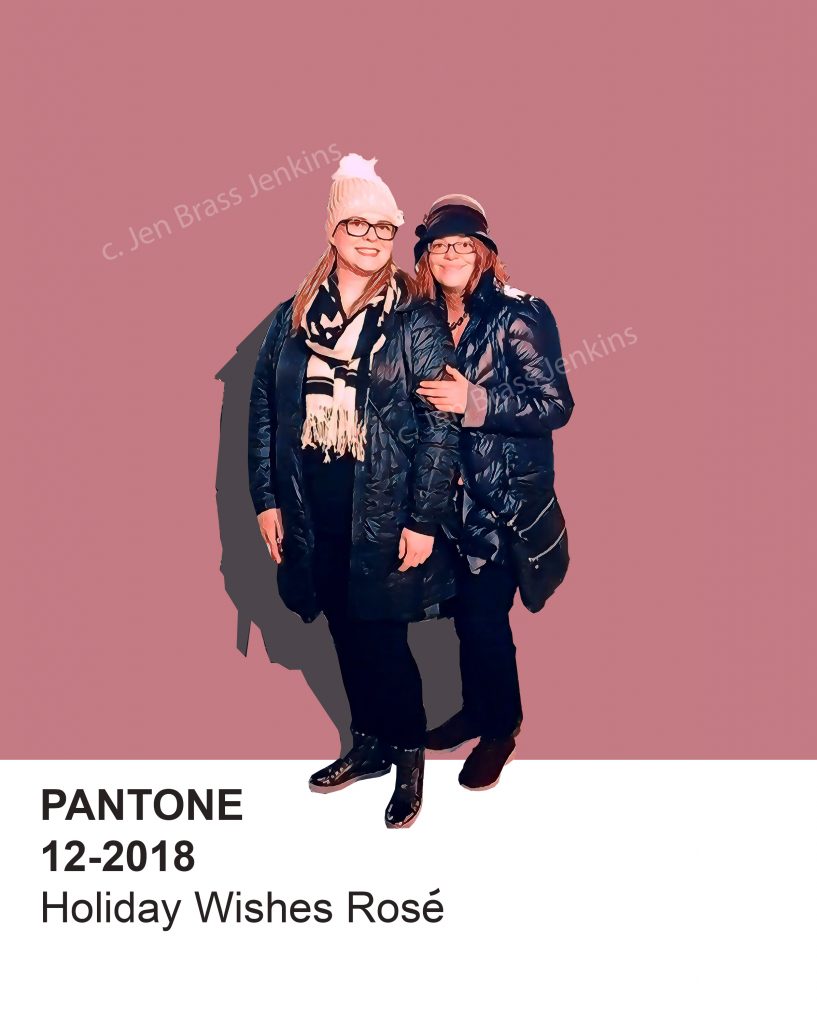
So we did a mash-up of a sisters photo on a Pantone color card. Do we drink Rose? No. But it’s an amazing name for a color…
Pantone App
So, there is also, of course, a Pantone app. It will take your photos and identify the palette picking out the dominant hues.
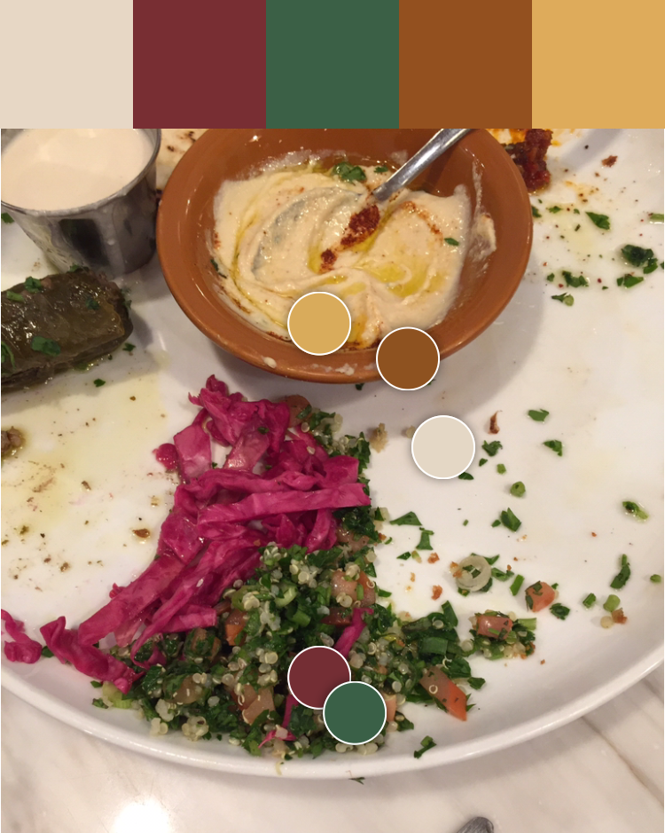
I LOVE IT. It definitely played a part in the card back design.
Card Back
We went simple with just two sides. Here’s the back:
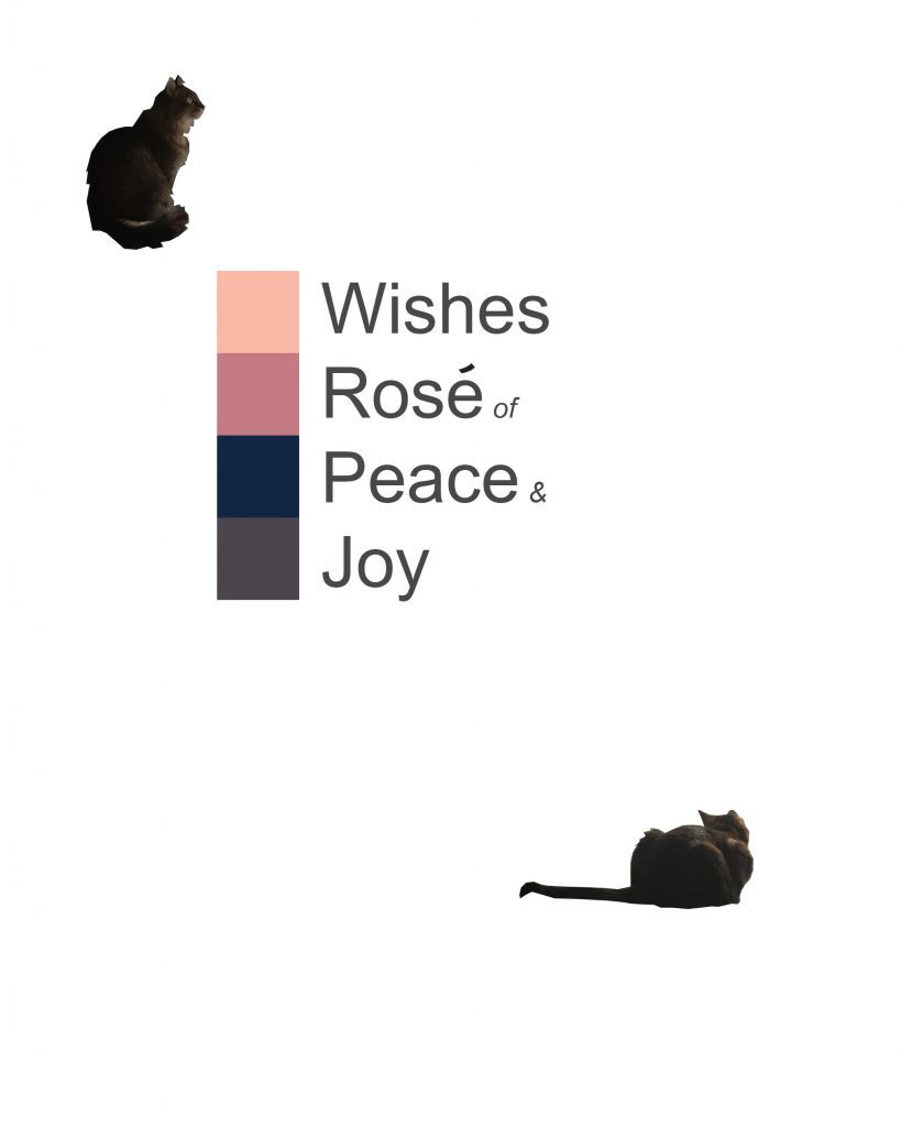
And that was it! A pretty quick put-together. Though, we work on our ideas and story the entire year. And sometimes we don’t!
